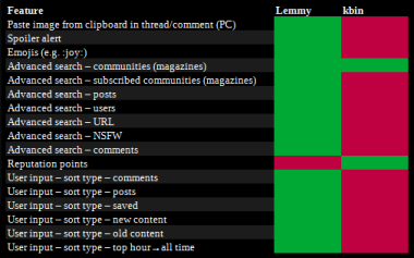
of all these beautiful features, gotta say the CSS styling on the mags is my FAAAAVVEEE. i love doing it. i kinda go overboard and need to reel it in, but the ability to personalize your mag is so fun. though, people should have an option to toggle mag styles off, they can be distracting or the best part about the mag lol (ㅅ´ ˘ `)
If you use it only for bookmarking threads, then kinda yeah.
But if you just give thumbs up to stuff without ever returning later, then it would probably be difficult to find your bookmarks from between.
My personal opinion?
I'd rather keep them apart, cos I feel they are a different function and useful apart as well.
I'm not sure what you mean by "Advanced Search -URL" but on Kbin you can put federated #links on the search bar to get (or create) the Kbin version. It works with microblogs, threads and comments.
Boosts are originally Mastodon's version of Twitter's retweets. By boosting a post, you share it with your followers.
Behind the scenes, this is how they're implemented on kbin too right now. Though it seems incomplete, as there's not currently a way to view content boosted by your followed users without visiting their profiles manually.
kbin currently uses boosts to sort threads by top, rather than upvotes. Which might be what you were referring to there.
Writing this out now, I realize it might not actually be a difference worth mentioning while it doesn't add anything unique besides added complexity and Mastodon integration (which just goes back to microblogging being a thing on kbin which is already covered).
CSS
CSS stands for Cascading Style Sheets and is a language to describe the visual design of websites.
An older version of Reddit (old.reddit.com) allowed subreddits to specify their own custom CSS code which would be used when users visited those subreddits. They could completely transform the design of the site using that feature. Or they could hack in features specific to their subreddit. Many subreddits both big and small made use of that feature and are still using it even today.
Spoilers for example were done using links and custom CSS long before Reddit added their official spoilers.
Kbin takes the same approach as old.reddit. Magazines can specify their own custom CSS code to change kbin's appearance while visiting the magazine. Though I have only seen one magazine make use of that so far, so it's not nearly as widespread as on Reddit yet.
new comments
On kbin, there's a setting in the sidebar (the gear icon) to mark new comments in threads you've seen before (since turning on the feature). I think it defaults to off.
When turned on and visiting a thread, new comments since your last visit are marked with a yellow bottom left corner. This is a very recent addition and seems to only be clear enough with the Tokyo Night theme currently. On other themes the colored corner is very hard to see for me.
"Random posts" and "Random threads" on sidebar. When you are in a particular thread/mag, this feature still serves randomised posts/threads but with related tags.
These points are not a priority, but relatively easy to achieve. They will gradually appear on the instance in between working on significant things. It's worth following https://kbin.social/m/kbinDevlog
Now I just need to find a convenient way to save this piece of code and copy-paste it whenever I need it 🤔
Honestly, I'd just suggest to add a button for it in the editor after the code one? I think it's a common enough thing to use to warrant it. For every other formatting maybe a little link for a pop up or expandable that shows the remaining formatting rules, similar to how it was on old.reddit.
I'm poking around at it now. I'm guessing it's probably something to do with JavaScript -- which I block by default via NoScript. (That's kind of odd though since I thought it was generating a <details>/<summary> HTML block server side, but maybe it's doing it on the client and I just happened to have JS unblocked when I saw it before?)
Edit: It looks like it is coming from this webpack'd JS file currently which I think is built from this JS source file; there is a handleSpoilers function defined which manipulates details/summary elements. Oddly, there is also PHP code for manipulating details/summary like I thought.
@ernest can chime in on if that's a temporary thing or what, but yeah, it seems to not work for me because I block JavaScript.
Yo, that is so good to know!
Wish there was a link to some quick stylesheet guide that kbin supports when you write a comment. Haven't seen this feature before.
Indeed, and then there is a whole raft of searching, sorting and filtering options for Microblog posts (aka Toots) which kbin does, and which Lemmy can't even see.
Yeah. The UI would be my key takeaway here. I just find Lemmy convoluted and confusing. Might be me just being too used to the old Reddit layout but I just like kbin more on that front.
There are browser extensions available that can help with the choice. From old-school Reddit habits, I tend not to use them on kbin, but here's an example from the one I use in other places: 🥦 (Hoping broccoli is a safe choice and doesn't have any weird alternative meanings.)
Having formatting codes for emojis is fine, but they are quite niche (does it even work for other languages?), it would be more convenient for most users to integrate a graphical emoji selector.
Well, English isn't my native language and I can still find an emoji within 1-2 seconds with a code (they're coded English).
Of course localizationing emojis (or anything) would need work done.